My Role
UX Design
Project Overview
We had only used the Visual Gallery AEM component on light colored backgrounds, so the use-case for a light-colored UI hadn’t arisen before. While building a promotional page in AEM, I wanted to use that component on a dark colored background. Therefore, the component required a lighter UI option to adhere to accessibility/design best practices and maintain easy visibility. So my goal was to create a mockup of the lighter-colored UI in the Visual Gallery component so that the dev team could build out the new reversed styling option.
Waters Visual Gallery Component
Reversed Styling

Process
I used Chrome's Inspect tool to create mockups of the reversed styling for desktop and mobile breakpoints. To maintain brand consistency, I selected light colors from the existing color palette. I then provided the dev team with the mockups, detailing which features required updated colors and specifying the exact hex codes. Once the dev team created the new styling in the Stage environment, they passed it back to me for UX review to make sure everything was displaying/functioning as expected. After my approval, we turned the policy on in the Production environment so we could begin using the reversed styling option wherever needed on live pages.
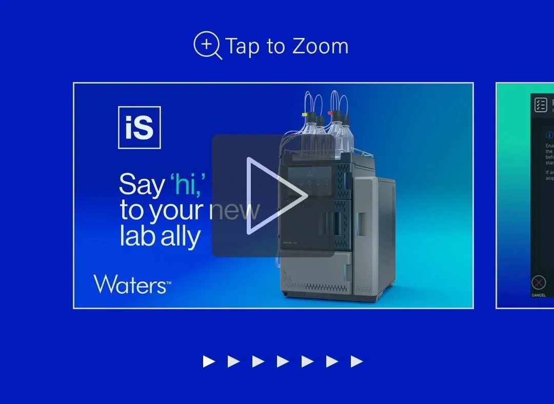
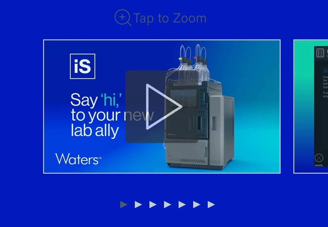
Before — Desktop
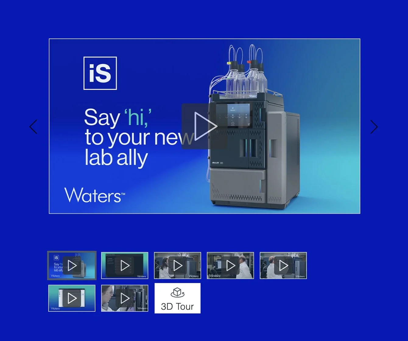
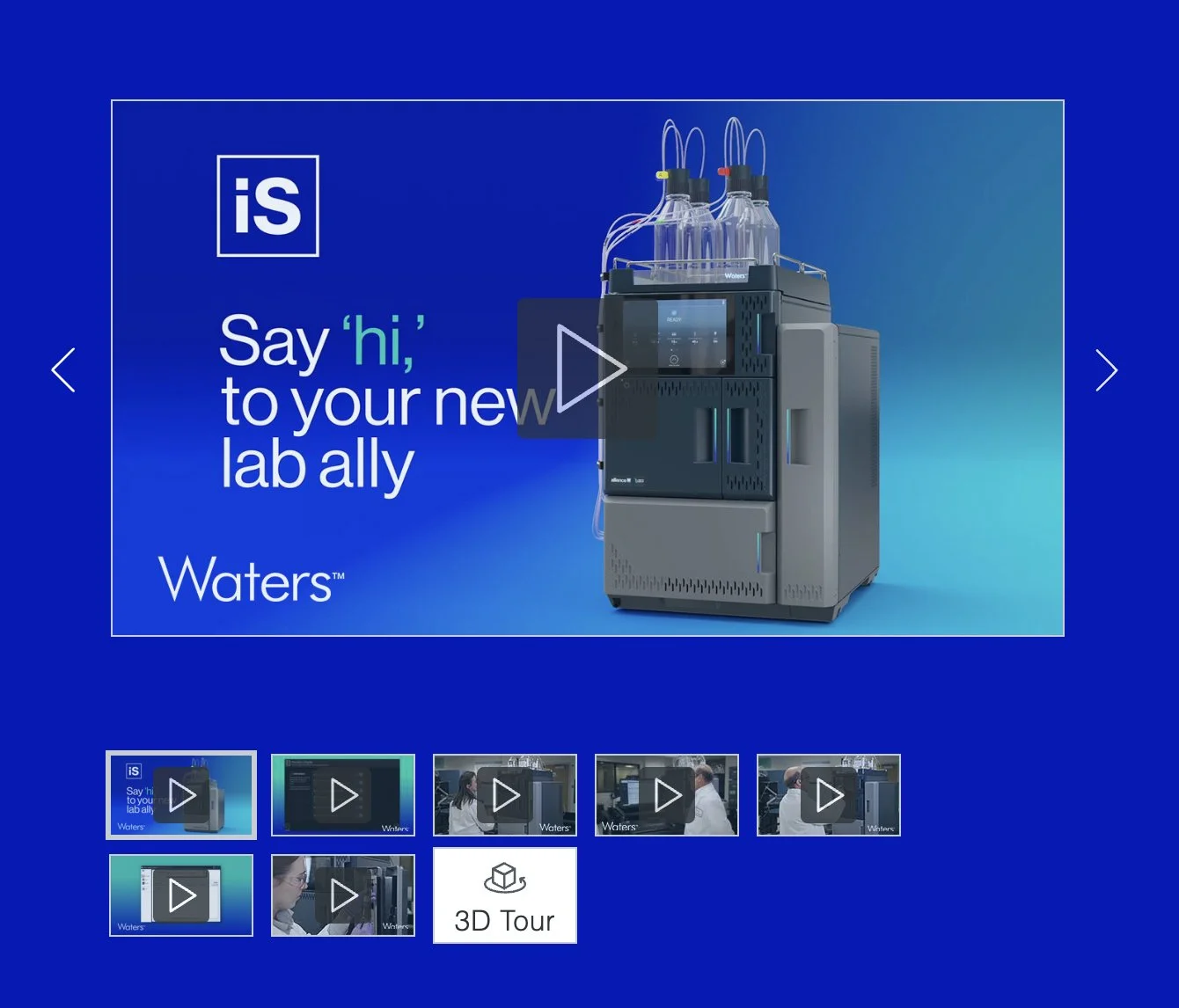
After — Desktop
Before — Mobile
After — Mobile